Émile Roux
Character
Evening folks, not sure if this is actually the appropriate place to start this topic or if it would of been more fitted in the Water Cooler or Writer's Workshop seeing as it's inherit purpose is to get some criticism and aid in learning this bloody beast of a program. If there's any issue, let me know and I'll recreate it in the proper place, alternatively whoever stumbles upon it can feel free to move it around as they see fit.
Without further ado, I need a bit of a second opinion, or several, in learning this stuff. Barely started using this stuff for about three days so I apologize in advance for any eye sore it may cause. To start, mostly been toying with a few emblems and attempting to properly crop them out of their original pictures to manipulate into something more fitting for my use, the problem is that I believe I reached a dead-end with what I can do by simply brute-forcing my way through the use of the magnetic lasso, magic wand, and a few hours of struggling to select one pixel at a time with the marque tool. The image I cropped out is in the spoiler below, one on a transparent background and one on a black background to better highlight the faults.


Below is also the original picture from which I cropped the emblem.

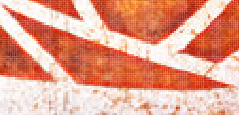
Now my primary question here is, what can I do to further improve the quality of the edges on every petal? As much as I try, some of the shapes are downright murderous to get right due to their design, the triangle at the bottom being a prime example.

The damn thing is well designed and gorgeous as far as I'm concerned, but the magnetic lasso goes bonkers when I try to work around it and the current example above is the best I've managed to achieve through simple brute-force. I need something better to properly top it off and I'm not sure what to do with it. Just as well, if someone could explain the phenomenon of phantom pixels and the color wheel the lasso uses when selecting pixels to me, I would be forever in your debt. I'm not sure if Phantom pixels is the correct term here but by them I mean stripes of pixels near very sharp edges that, for all intents and purposes, are not actually selected on the image with the magnetic lasso. Nevertheless, deselecting the unselected space where they are approximately located seems to remove them when pasting the selection onto a new work space and it's boggling my mind something fierce.
Without further ado, I need a bit of a second opinion, or several, in learning this stuff. Barely started using this stuff for about three days so I apologize in advance for any eye sore it may cause. To start, mostly been toying with a few emblems and attempting to properly crop them out of their original pictures to manipulate into something more fitting for my use, the problem is that I believe I reached a dead-end with what I can do by simply brute-forcing my way through the use of the magnetic lasso, magic wand, and a few hours of struggling to select one pixel at a time with the marque tool. The image I cropped out is in the spoiler below, one on a transparent background and one on a black background to better highlight the faults.


Below is also the original picture from which I cropped the emblem.

Now my primary question here is, what can I do to further improve the quality of the edges on every petal? As much as I try, some of the shapes are downright murderous to get right due to their design, the triangle at the bottom being a prime example.

The damn thing is well designed and gorgeous as far as I'm concerned, but the magnetic lasso goes bonkers when I try to work around it and the current example above is the best I've managed to achieve through simple brute-force. I need something better to properly top it off and I'm not sure what to do with it. Just as well, if someone could explain the phenomenon of phantom pixels and the color wheel the lasso uses when selecting pixels to me, I would be forever in your debt. I'm not sure if Phantom pixels is the correct term here but by them I mean stripes of pixels near very sharp edges that, for all intents and purposes, are not actually selected on the image with the magnetic lasso. Nevertheless, deselecting the unselected space where they are approximately located seems to remove them when pasting the selection onto a new work space and it's boggling my mind something fierce.


